When I began painting in early 2000’s, color was trending the way of tan, beiges, oranges and yellows. Yikes, right? This was way before everyone had Pinterest boards on what they wanted their dream houses to look like.
Color trends will always continue to change and I’m sure we’ll end up on that beige train again.
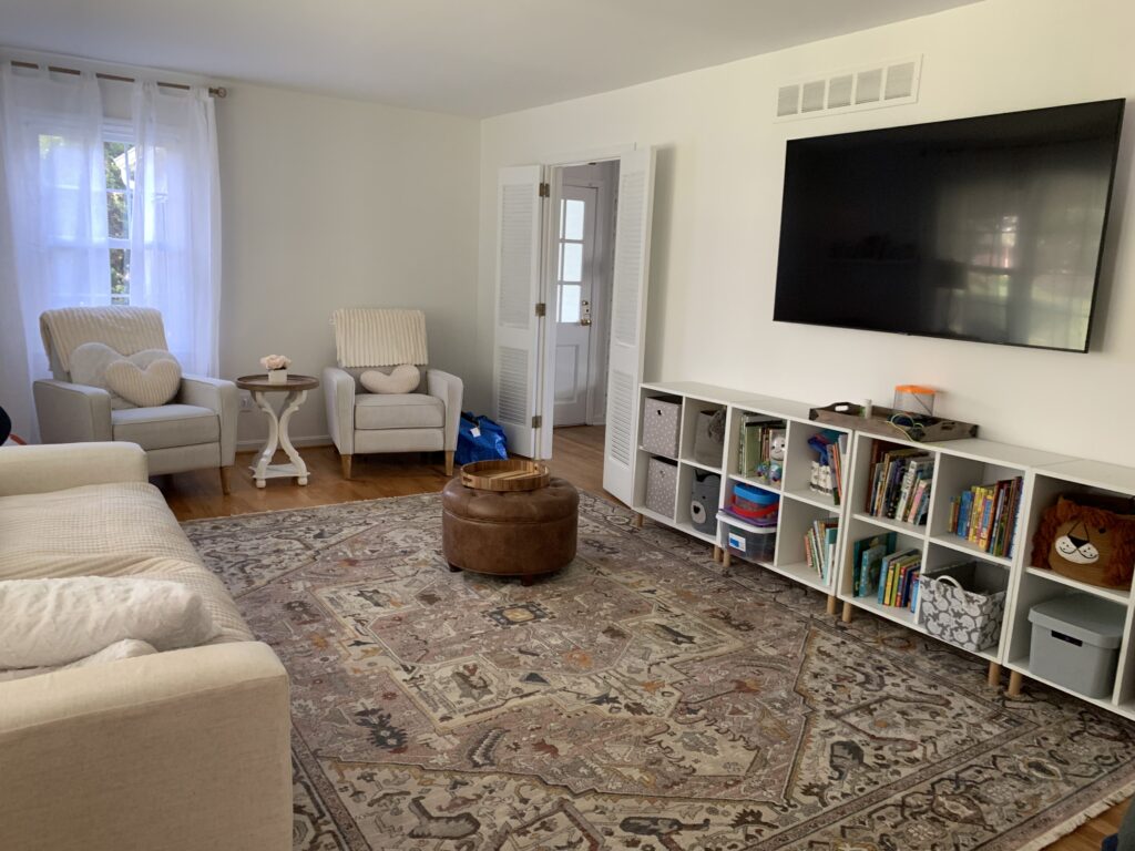
The most recent trends are some of my favorites. The off whites… think Boho chic, Farmhouse even… But, finding the right white is not as easy as you may think. With all the paint manufactures, each having way too options, I’m here to help pick the “right” white. My personal favorite white that I’ve used in recent years, is Benjamin Moore OC-57 White Heron. This color has 2 very small drops of gold colorant to produce the color. This produces a creamy undertone for the white. In some lights it can appear to have a slightly gray undertone. If you’re thinking about a color for the whole house and you want a color that will age well, this could be the one for you.

Pair it with bright white ceilings and trims and you’ll have a perfectly livable, comfortable, sellable colored house.
Looking for something with a little more color or different undertones for your white?
Sherwin Williams Eider White SW7014. Beautiful color in MOST places but watch out for the lighting, because this one can produce a gray or purple undertone, which may not be what you were hoping for. But if you’re looking for something with a hint of purple.. Eider White is a great option.

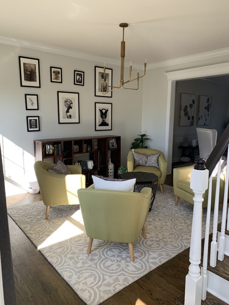
What about something that feels kind of spa like and modern? Sherwin Williams HGSW 4059 Celery Root has just a hint of a green undertone that can look magnificent in big open areas, offices, bedrooms, even the basement!
Or if you’re looking for a color with a slight blue undertone. Benjamin Moore’s Paper White OC-55 is a beautiful choice!
Other off white color trends:
Sherwin Williams Greek Villa SW7551. This one has some mild yellowish undertones, but is very classy looking and I’ve never had it look too yellow.
Sherwin Williams Snowbound SW7004 can brighten up any room, but the wrong lighting has proven to cast off a pinkish hue.
Benjamin Moore Cloud Cover OC-25 is a beautiful off white that looks good in any room!
One thing that you need to pay close attention to when picking colors are the undertones. Doing a basic internet search of the color you are thinking about will often not be the best source of a correct assessment. There have been countless times when someone is looking for a certain color and they’ll show it to me, I’ll point out the undertones and they will scowl. But you want to know if that gray that you’re thinking about doing is actually a purple or a blue. Which is a very common issue.
Do yourself a favor and don’t rely on pictures in magazines or on any type of screen. They don’t represent the color fully. Get the actual color sample card from the paint store, or order full size sheets www.samplize.com. And if you’re having a hard time deciding, go with samples. And painting a little square on the wall does help, but not as much as committing to sample on an entire wall. Two coats. Painting is expensive, even if you are doing it yourself. Let us help getting the right color the first time!
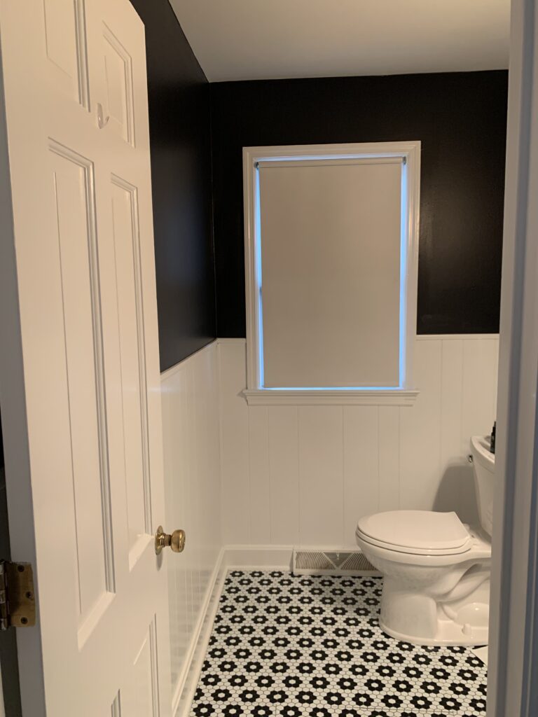
Also, color trends do come and go. Something that looks great today, (all these gray houses) will eventually feel dated. Knowing what you like and what makes you feel good is more important than any trend! So although I’m pushing the off whites, I love meeting bold individuals who show their personalities with colors they love. And I personally will always push a black powder room.

We hope you have enjoyed this blog about color trends in Mechanicsburg for the fall of 2022, written by Just Add Paint with help from the designing brain of Lauren Eubanks. Just Add Paint, LLC, is a residential house and cabinet painting company located in Mechanicsburg, PA. Just Add Paint is an accredited member of the National PCA, and maintains a 5-STAR review among all major ratings platforms.


